Trading "Techniques": Sharing on the Application of Technical Indicators
TechFlow Selected TechFlow Selected
Trading "Techniques": Sharing on the Application of Technical Indicators
For the secondary market, we can also divide investing into Dao (principles), Fa (frameworks), and Shu (techniques), all of which are indispensable.
 Navigating Web3 tides with focused insights
Author: Uncle Jian
Knowing is not difficult; doing is hard. In secondary market investing, everyone knows not to be greedy or chase rising prices and sell in falling markets, yet how many can truly control their impulses and achieve alignment between knowledge and action? In the Tao Te Ching, Laozi mentions Dao, Fa, and Shu. Dao refers to principles, natural laws, and core philosophies. Fa represents methods, rules, and systems. Shu stands for techniques and operational practices. Together, Dao, Fa, and Shu form essential guidelines for personal conduct and societal development.
When it comes to the secondary market, investment can similarly be divided into Dao, Fa, and Shu—and all three are indispensable.
-
Dao: Represents investment philosophy and belief—the direction, goals, and values of investing. This includes analysis of long-term market trends, macroeconomic conditions, and fundamentals.
-
Fa: Refers to investment principles and rules, including investment strategies, risk management, and asset allocation.
-
Shu: Encompasses technical analysis, quantitative analysis, and trading psychology.
This report will focus specifically on "Shu" (technique) in trading, aiming to share practical applications of technical indicators and technical analysis. For most people, there's no need to learn numerous obscure technical indicators, as these indicators are inherently lagging and cannot directly generate profits. Instead, this report will cover commonly used technical indicator methods to help more people understand the value of technical analysis.
Disclaimer: The cryptocurrencies and indicators mentioned in this report do not constitute investment advice and are intended solely for educational purposes. Investment suggestions and indicator usage described herein may not apply to all coins or products. Blockchain investments carry significant risks—you could lose your entire principal. Please conduct your own research.
1. MA (Moving Average): Explanation and Application
The MA (Moving Average) indicator calculates the average price over a specified number of periods. For example, MA5 represents the average price across five timeframes (including the current one), whether measured in minutes, hours, or days. A smaller MA number reacts more sensitively to short-term fluctuations, while a larger MA number reflects slower, longer-term movements.
The MA settings depend on individual preferences. Here, I’ll share two MA-based trading methods I commonly use: the Vegas Tunnel and the Squeeze Tunnel.
Vegas Tunnel
The Vegas Tunnel, in simplified terms, uses the 144-day and 169-day moving averages to assess medium- to long-term trends. It is not suitable for timeframes below 15 minutes and works best on hourly charts and above.
Why these two moving averages?
Upon closer inspection, 144 and 169 are squares of 12 and 13 respectively—numbers rooted in Gann’s Square Theory and the Fibonacci sequence. Specifically, 144 originates from Gann’s Square Theory, while 169 is the square of 13, a Fibonacci number. Their combination proves effective in real-world trading scenarios.
Example:
Take OP’s 4-hour chart as an example. When the 144-day MA crosses above the 169-day MA, forming a golden cross, it signals a medium- to long-term bullish trend—suggesting a potential entry point. Conversely, when the 144-day MA crosses below the 169-day MA, forming a death cross, it indicates a bearish shift—prompting a long-term exit and cautious observation.
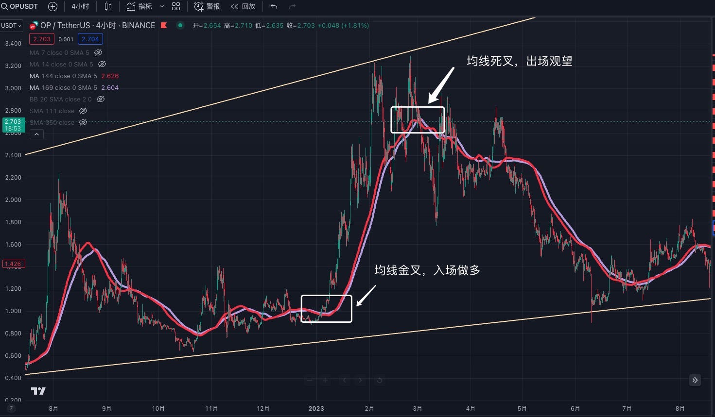
Some might argue: Isn't this too simplistic? What about instances where the MAs repeatedly cross during sideways markets—aren’t you just gambling?
My response: Since the 144-day and 169-day MAs cannot effectively capture short-term movements due to their lag, adding shorter-term MAs like 7-day and 14-day can help confirm short-term trends. By using higher-timeframe MAs to determine the broader trend and lower-timeframe MA crossovers for confirmation, we can maximize reliability.
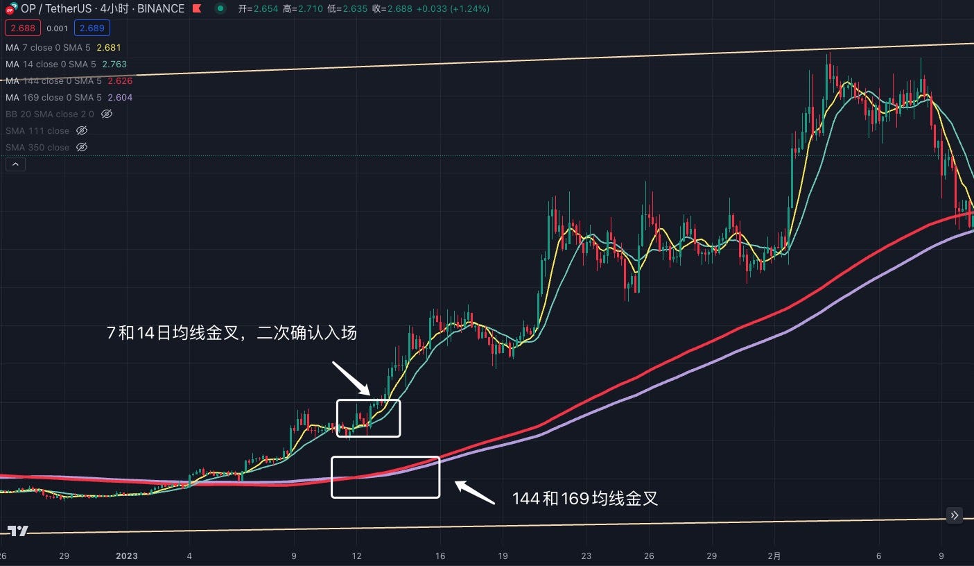
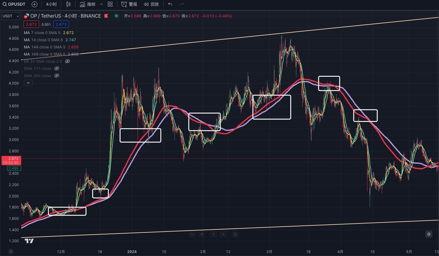
The Vegas Tunnel helps identify medium- to long-term trends. Due to its inherent lag, it should be supplemented with short-term MAs for validation. Strong bullish trends typically show both the 144-day and 169-day MAs trending upward. If price consolidates near these MAs, the short-term momentum is weak—making it unsuitable for entry. Additionally, the 144-day and 169-day MAs often act as reliable support and resistance levels, useful for short-term bounce trades.
Squeeze Tunnel
The Squeeze Tunnel draws inspiration from the mathematical Squeeze Theorem in calculus. In simple terms, if a function is bounded between two other functions that converge to the same limit, then the squeezed function also converges to that limit.
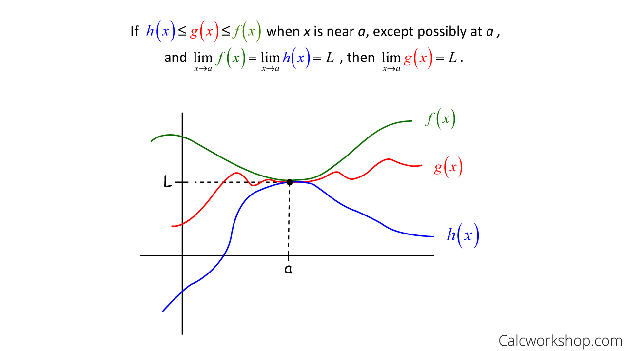
In trading, we can apply a similar concept using two MAs: 111 and 350. Given the long cycle of the 350 MA, this method is recommended primarily for short-term trading.
Why these two MAs?
Dividing 350 by 111 gives approximately 3.15—very close to π (pi). Alternatively, dividing 350 by 3.14 yields a result closest to 111.
Example:
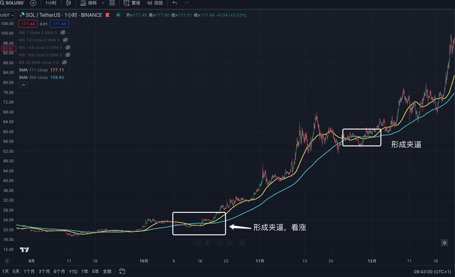
Using TRB’s 1-hour chart, when the blue line (350 MA) is above and the yellow line (111 MA) is below, forming a triangular or near-triangular pattern, it signifies a successful “squeeze.” After such a formation, the price is likely to rise. However, note that for a valid squeeze, the 111 MA must cross through the 350 MA. If only one side crosses, the pattern is invalid.
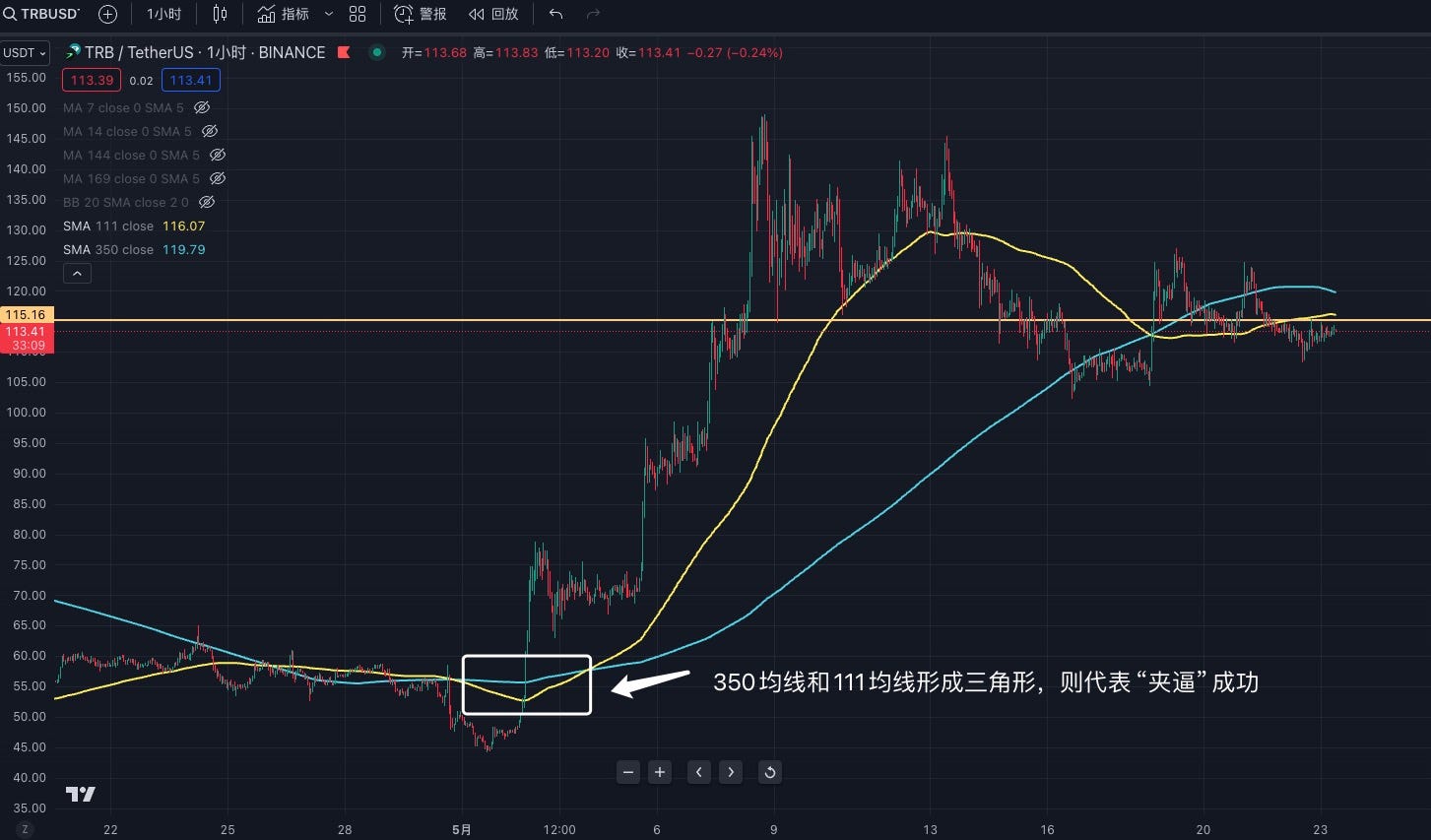
This tunnel works best on 1-hour and 4-hour timeframes. While its accuracy is moderate, when a squeeze does succeed, it often leads to substantial moves. Therefore, traders should pay close attention whenever this pattern appears and consider confirming it with other technical indicators.
MACD (Moving Average Convergence Divergence)
MACD (Moving Average Convergence and Divergence) is one of the most widely used technical indicators in trading. At its core, MACD analyzes changes in price momentum by comparing moving averages of different periods, thereby generating buy and sell signals. The MACD consists of three main components: the zero line, the MACD line, and the signal line. Traders primarily observe three types of changes.
Three Key Changes in MACD:
1. Crossover between MACD Line and Signal Line:
-
Buy Signal: When the MACD line (blue) crosses above the signal line (yellow), it suggests positive momentum—consider going long.
-
Sell Signal: When the MACD line (blue) crosses below the signal line (yellow), it suggests weakening momentum—consider selling.
2. Relationship between MACD Line and Zero Line:
-
Above Zero Line: Indicates the short-term MA is above the long-term MA—bullish trend.
-
Below Zero Line: Indicates the short-term MA is below the long-term MA—bearish trend.
3. Histogram Changes:
-
Histogram turns positive: When the histogram shifts from negative to positive, the MACD line is above the signal line—momentum is strengthening, indicating a buy signal.
-
Histogram turns negative: When the histogram shifts from positive to negative, the MACD line is below the signal line—momentum is weakening, indicating a sell signal.
Example:
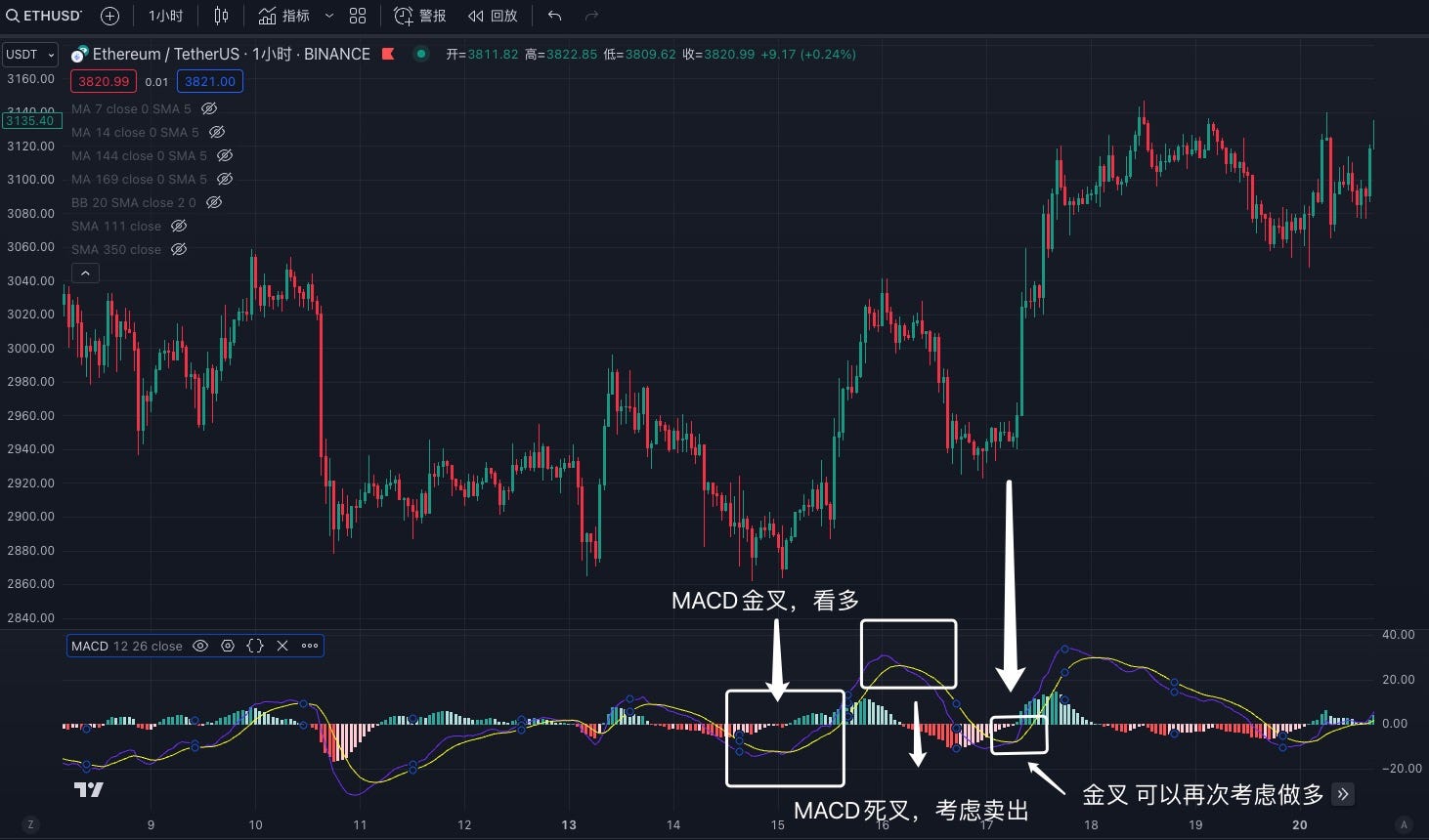
Using ETH’s 4-hour chart, when the MACD line crosses above the signal line, it signals bullish momentum. Conversely, when the signal line crosses above the MACD line, it signals bearish momentum. MACD is applicable across all timeframes—from 1-minute charts to weekly charts.
Advanced Use of MACD and MA
Beyond basic MACD and MA usage, merely understanding these tools isn't enough. These techniques are publicly available, and market makers or whales often exploit them by creating "false patterns" to lure inexperienced traders into buying—making them feel they'll miss out otherwise. In reality, this is precisely how they trap you.
How to detect and avoid such false signals?
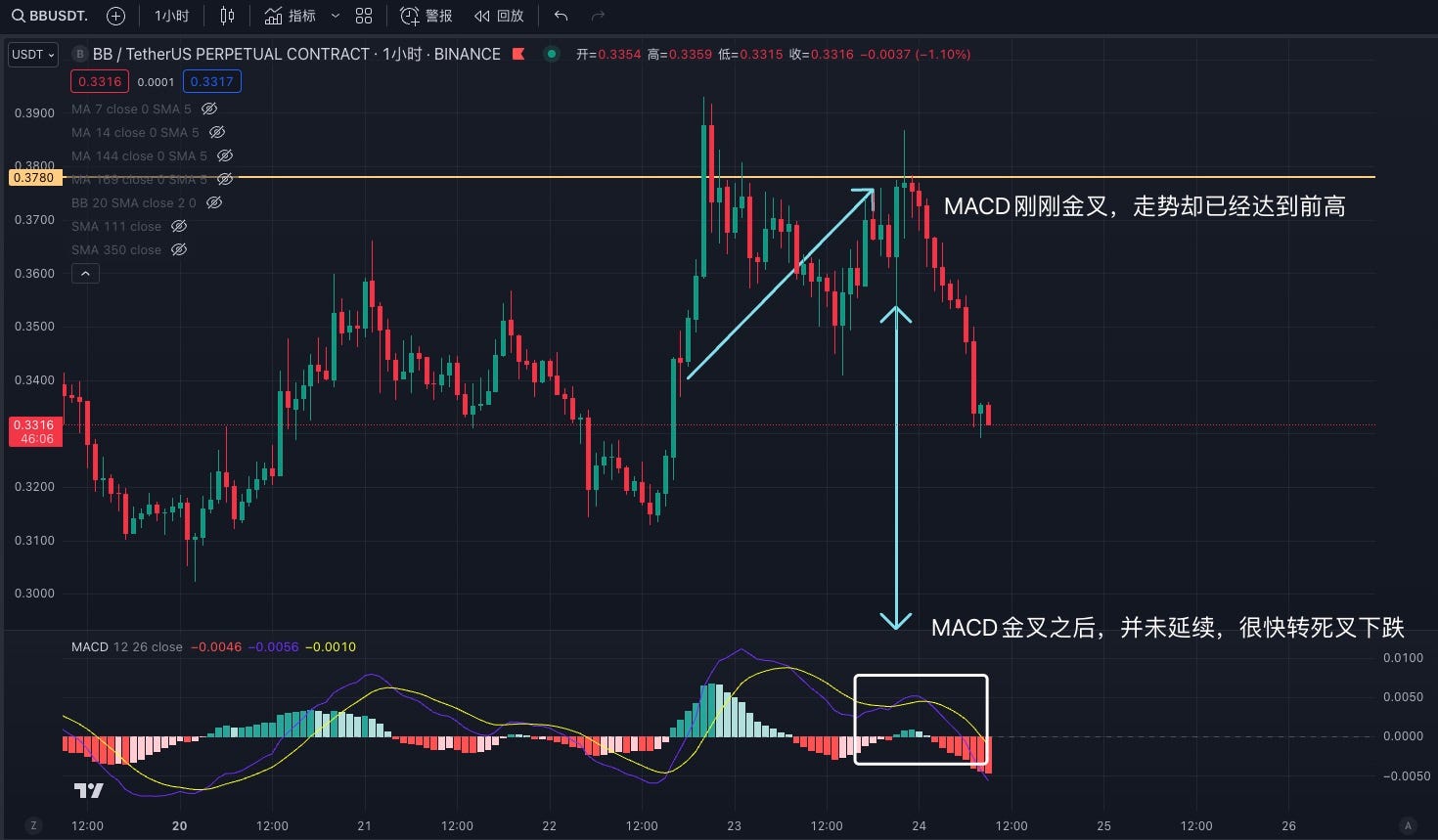
False signals often involve MACD golden crosses designed to entice new traders. Take BB’s 15-minute chart: after breaking to a new high, the price quickly reverses and enters a death cross, signaling a pullback. During the retracement, the price rapidly recovers and approaches the previous high, but the MACD has only just formed a golden cross. We interpret this as “all show, no go”—price reaches prior highs, but MACD lags behind. Over 80% of such cases end up reversing shortly after, just like in the image below.
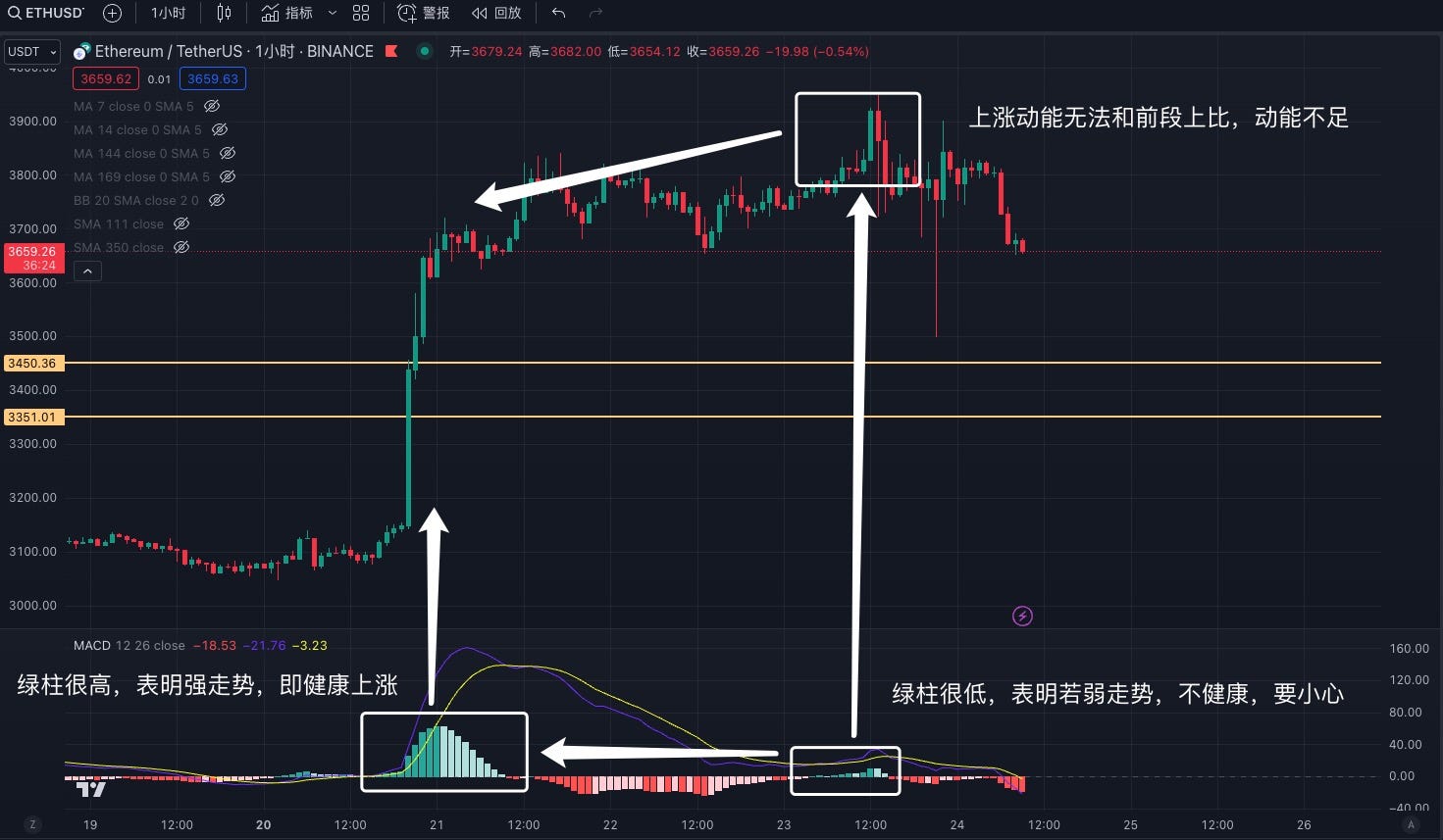
Now take ETH’s 1-hour chart: the MACD forms a golden cross, green bars surge, and price rises accordingly. This is a strong, healthy rally—indicating a good opportunity to enter. Later, price consolidates, and MACD turns to a death cross. After consolidation, MACD re-enters a golden cross—but this time, the price fails to sustain upward momentum. The histogram doesn’t show sustained strength either. This “barely hanging on” condition is dangerous. Even though MACD shows a golden cross, the lack of strength makes it risky. The longer this weak state persists, the greater the danger. When price reaches a new high but MACD fails to confirm it, this is called a “bearish divergence”—a strong sell signal. Conversely, when price hits a new low but MACD doesn’t follow suit, it’s a “bullish divergence”—a potential buy signal.
2. BOLL and RSI: Explanation and Application
BOLL (Bollinger Bands)
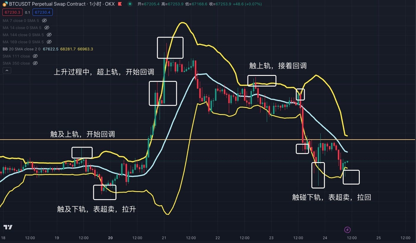
Bollinger Bands were developed by John Bollinger, a U.S. stock analyst, based on the statistical concept of standard deviation. It is a simple yet powerful technical analysis tool. I believe it holds great value in blockchain trading. BOLL consists of three lines: upper, middle, and lower bands. These bands represent resistance and support levels. When price touches the upper band, it may face resistance and pull back. When it hits the lower band, it may find support and rebound. Price moving beyond the upper band indicates overbought conditions—with a high chance of correction—but also suggests strong bullish momentum. Conversely, price breaking below the lower band signals oversold conditions and weak sentiment. When price falls from the upper band to the middle band, the middle band acts as support. If it breaks below, the middle band becomes resistance. When price rises from the lower band to the middle band, it faces resistance. A breakout and hold above the middle band transforms that resistance into support.
Here are 10 golden rules of Bollinger Bands—extremely important:
1. Price breaking above upper band—watch for pullback
2. Price breaking below lower band—watch for bounce
3. Strong uptrends stay above middle band
4. Weak downtrends stay below middle band
5. Narrowing bands suggest impending breakout
6. Wider bands indicate stronger momentum
7. Middle band indicates trend direction
8. Sudden band contraction signals reversal
9. Sudden band expansion ends consolidation
10. The longer and tighter the contraction, the more dramatic the upcoming move.
Example:
Using BTC’s 1-hour chart: BOLL consists of upper, middle, and lower bands. Price exceeding the upper band signals overbought conditions—likely to correct. Price falling below the lower band signals oversold conditions—likely to rebound.
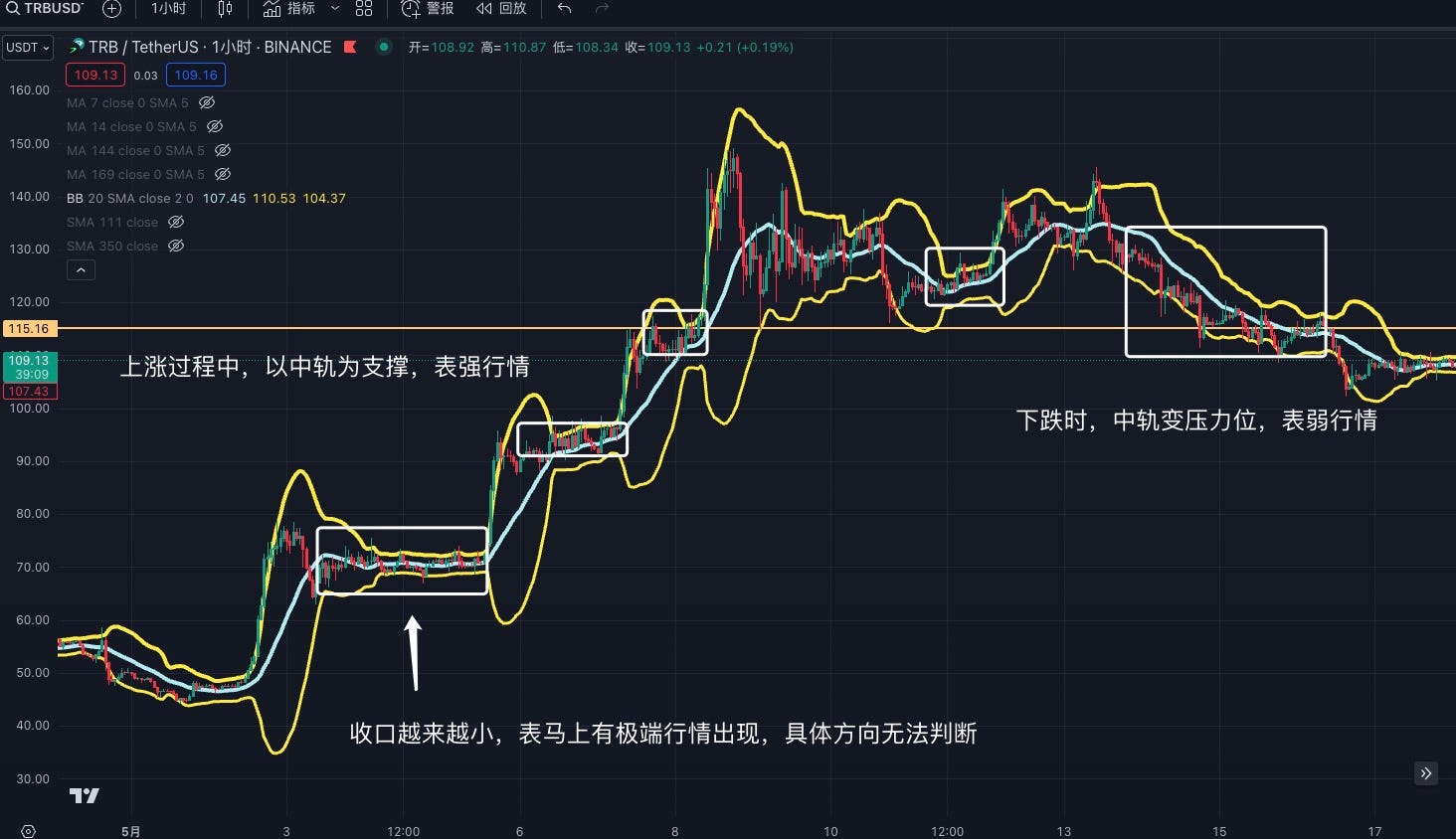
Now take TRB’s 1-hour chart: when BOLL bands contract, it signals a potential extreme move. However, BOLL alone cannot predict direction—other indicators are needed. The longer the contraction, the shorter the bands, the more explosive the future move. In strong uptrends, price moves steadily along the middle band. In extremely strong rallies, price stays consistently above the upper band. In downtrends, price follows the middle band downward—turning it from support to resistance. In severe downtrends, price remains below the lower band.
RSI (Relative Strength Index)
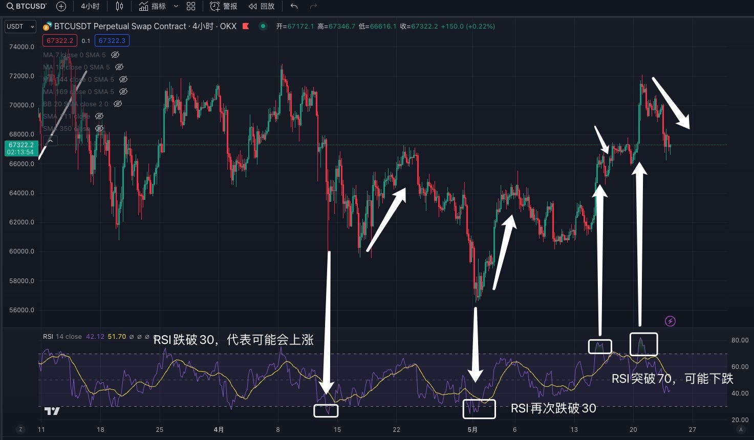
RSI (Relative Strength Index) measures the magnitude of recent price changes to evaluate overbought or oversold conditions and forecast trend continuation or reversal. RSI ranges from 0 to 100—no matter how extreme the price movement. Simply put: RSI above 70 suggests overbought conditions—increased risk of pullback. RSI below 30 suggests oversold conditions—potential for rebound.
Example:
Using BTC’s 1-hour chart: when RSI drops below 30, it suggests consolidation or pullback. But this isn’t absolute—it only indicates weak momentum, not a direct buy signal. When RSI exceeds 70, it signals overbought conditions—possible correction. Still, RSI alone shouldn’t drive trading decisions. Note: In extreme markets, RSI can reach 99 or drop to 1—so never rely solely on RSI for decision-making.
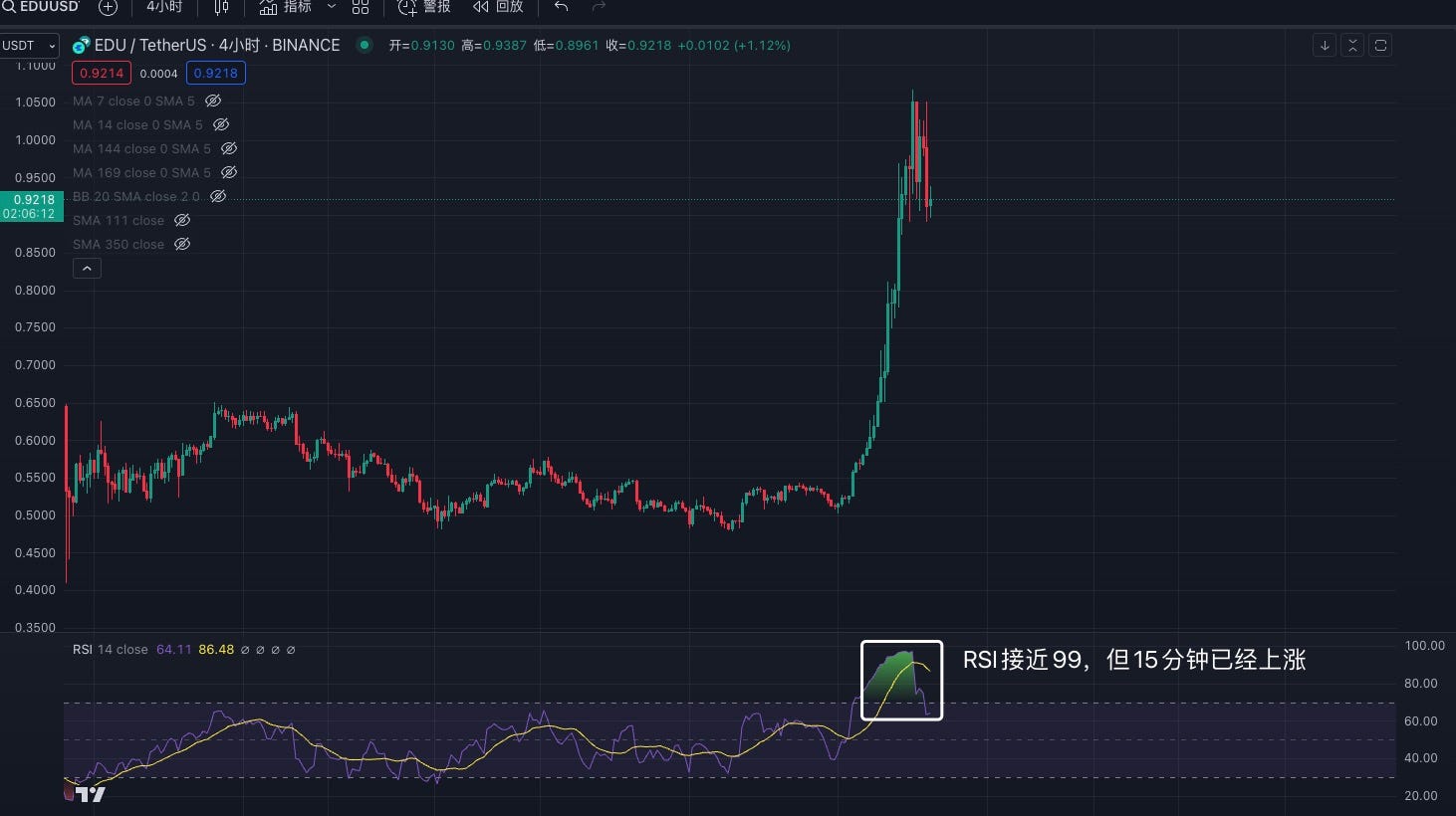
Now take EDU’s 4-hour chart: after RSI breaks above 70, it keeps rising—eventually hitting 99. Thus, blindly buying at 30 and selling at 70 doesn’t work. You must assess the nature of the asset—is it a small-cap, meme coin, or highly controlled token? Compared to blue-chip coins, smaller altcoins may require adjusting RSI thresholds to 90 and 10 instead of 30 and 70. This requires judgment and experience.
3. Flag Pattern Variations
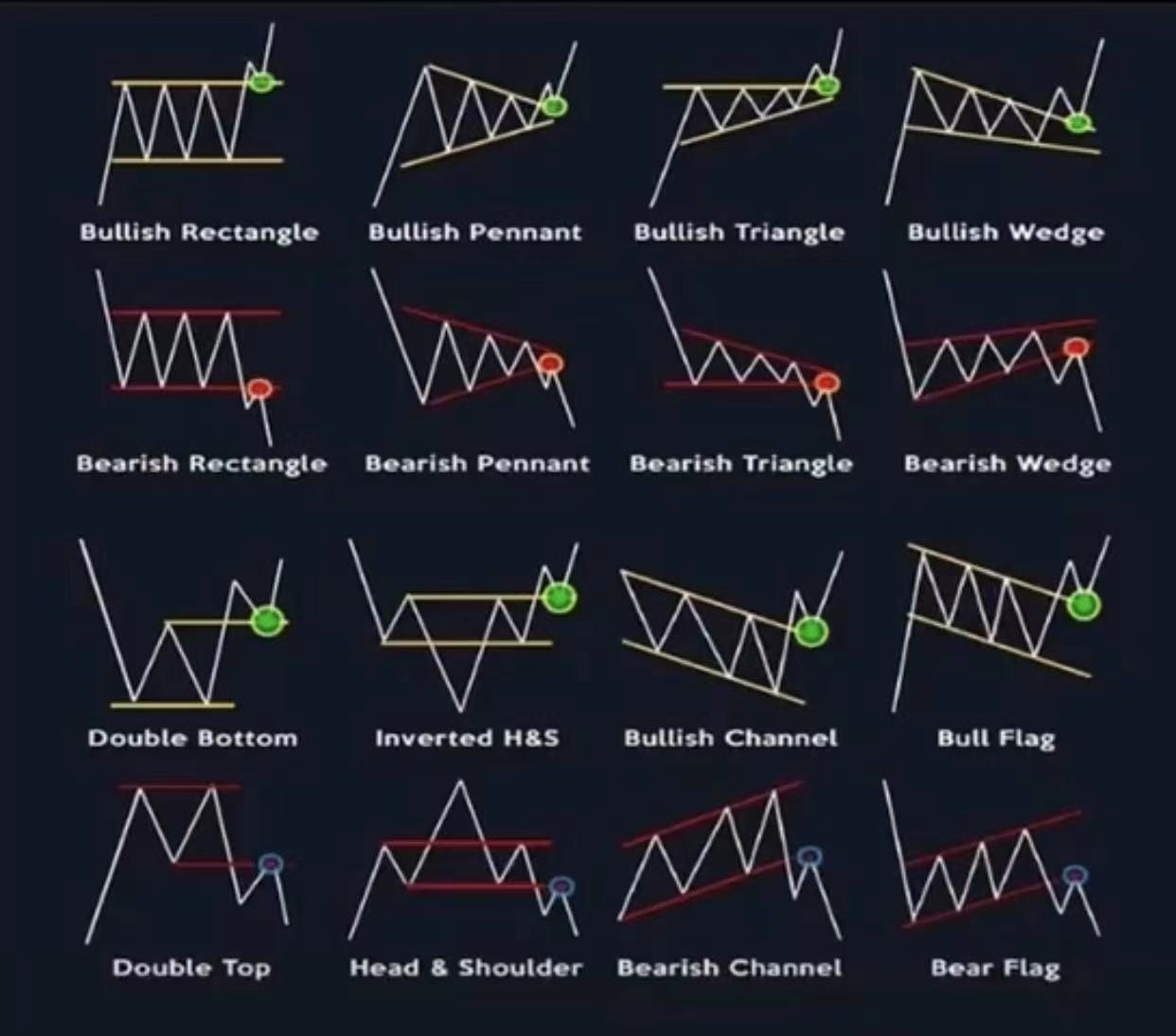
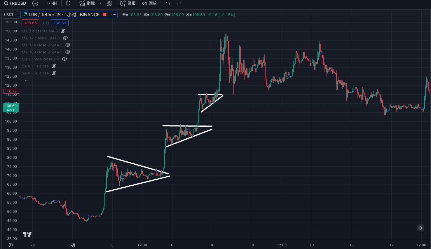
Flag patterns, also known as triangle consolidations, are not based on indicators but on price action formations. There are 16 common variations. Recognizing these patterns can lead to high-probability trades—typically bullish. However, failures occur. It’s advisable to enter near the flag’s low point. Once price breaks out above the triangle zone, that breakout level becomes support—offering a second entry opportunity if price pulls back.
Example:
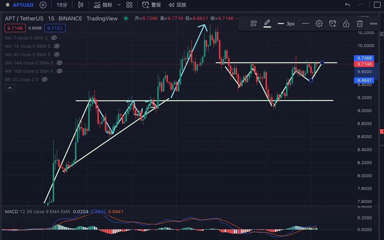
Take APT’s 15-minute chart: its movement closely mirrors the third and tenth patterns shown above. However, note this is a success case. Market makers often create fake patterns to trap traders—so remain vigilant and use stop-losses.
Now examine TRB’s 1-hour chart: it clearly exhibits a three-week flag consolidation, followed by a 3x surge. So next time you spot a similar pattern, draw it out and verify.
4. Conclusion
As the saying goes, in trading, Dao, Fa, and Shu are all essential. This report focuses only on “Shu”—technical execution. Merely mastering technical indicators is far from sufficient. The market evolves constantly, refreshing its patterns, pump tactics, and dump strategies roughly every three months. Traders must keep observing, summarizing, and adapting to subtle market shifts.
People are flexible; indicators are rigid. Technical indicators exist to assist decision-making under well-understood conditions and proper risk controls—they cannot generate profits directly. All technical indicators are lagging and never 100% accurate. Only with thorough understanding and disciplined risk management can they aid investment. Otherwise, it’s just gambling.
Moreover, technical indicators are far more complex than presented here. Each has countless variations and methodologies. With deep study, any single indicator could take years to master. This article doesn’t cover all nuances. Furthermore, every trader has a unique style—indicator usage must be tailored accordingly.
Join TechFlow official community to stay tuned
Telegram:https://t.me/TechFlowDaily
X (Twitter):https://x.com/TechFlowPost
X (Twitter) EN:https://x.com/BlockFlow_News
 @jianshubiji