Spent 11 days erasing rate cut expectations, fully revived in 1 day: Fed pivot could trigger major market shifts
TechFlow Selected TechFlow Selected
Spent 11 days erasing rate cut expectations, fully revived in 1 day: Fed pivot could trigger major market shifts
Broad market participation = healthy market; centralized returns = the role of the indexing mechanism.
Author: Duality Research
Translation: TechFlow
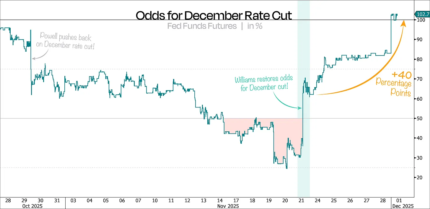
In just 11 days, the market erased any possibility of a December rate cut—then, in a single day, that possibility came roaring back.
As we anticipated, Federal Reserve officials last week completely walked back their previous hawkish tone, pushing the odds of a December rate cut up by another 40 percentage points.
As shown in our first chart, this probability has now risen to 102%—more than four times higher than just a few days ago—all without any meaningful new data. This undoubtedly raises questions about the Fed’s communication strategy.
As we said previously, this market pullback was entirely driven by the Fed, so a dovish pivot was always likely to significantly boost risk assets again.
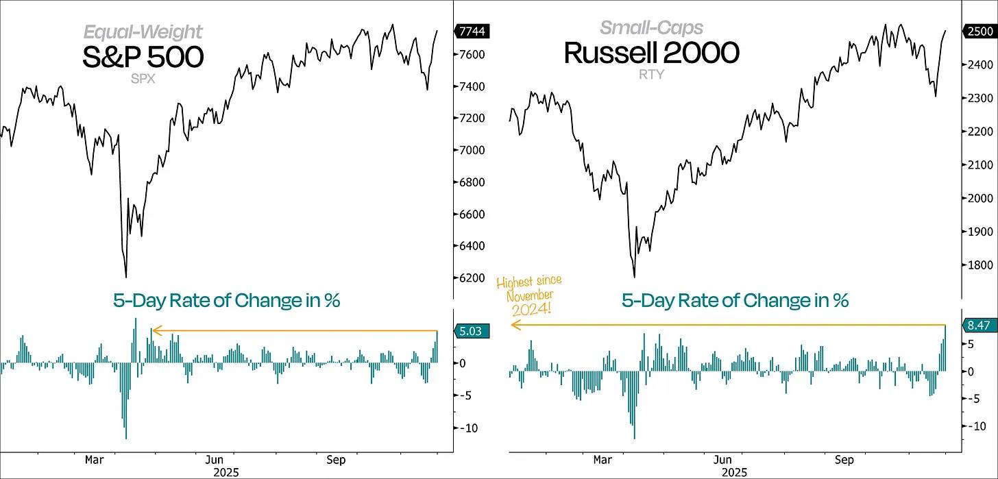
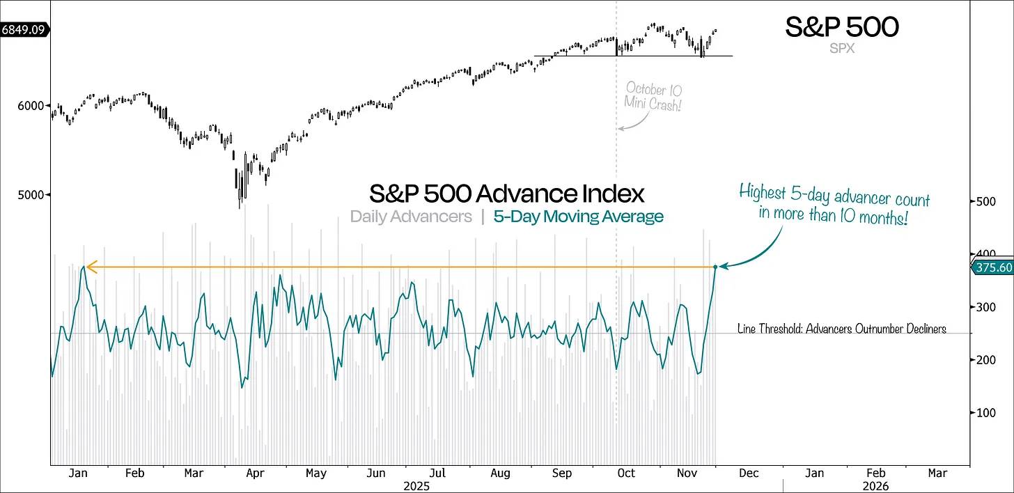
Moreover, this rebound has been broad and high-volume—not merely an oversold bounce, but a genuine wave of buying. The best way to see this is by examining the 5-day rate of change in the equal-weight S&P 500 and the Russell 2000.
Typically, major moves begin with strong momentum, and we’ve just witnessed the strongest 5-day rally since April. This is not only a positive sign but also a loud and clear signal that “the market is turning.”
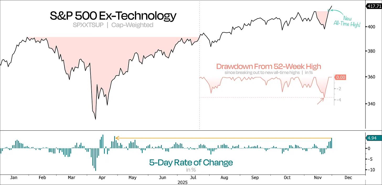
Even more encouraging is the sharp rise in demand at key levels—and perfectly timed too. Crucially, the S&P 500 continued climbing even as Nvidia’s stock declined.
As shown in our next chart, the broader market appeared weak when excluding tech. Yet thanks to recent positive shifts, the S&P 500 ex-tech index hit a new all-time high just three days after experiencing its deepest pullback since the July breakout.
In contrast, the tech sector still remains over 6% away from its own fresh highs.
This is a textbook “Shake ’n Bake” reversal—shorts thought the trend was settled, only to be met with powerful momentum. Weak holders were shaken out, followed by a strong and sustained rebound.
Recently, we’ve seen similar patterns across multiple stocks tied to the real economy, which previously looked on the verge of collapse—a bad omen during a bull market.
Take regional banks and retail: both briefly broke below their anchored VWAP (volume-weighted average price) from the April lows, but then captured strong momentum and rallied above the anchored VWAP from the September highs.
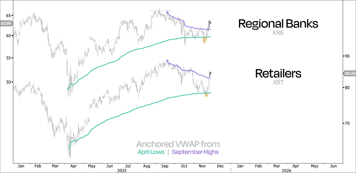
This pattern has emerged across numerous other sectors, including homebuilders, equal-weight discretionary consumer goods, industrials, and small caps overall. This bodes well for the rally, especially given these areas had lagged for much of the year.
The good news is that market participation is broadening, and leadership since Nvidia’s reversal is exactly what we’d want to see. If this bull market is to expand further, now is the time.
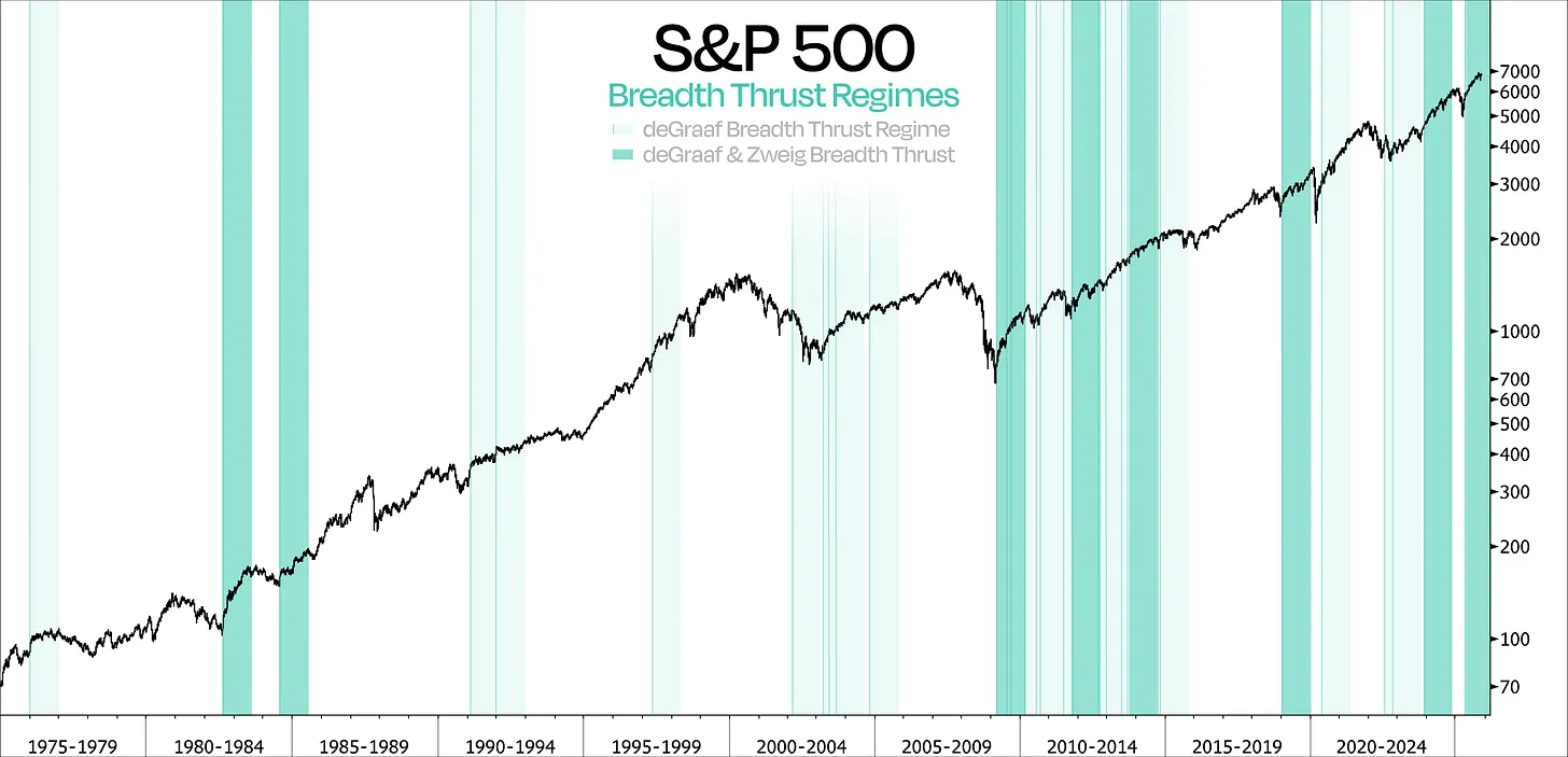
This week could firmly confirm and solidify the trend if there’s a strong chance of a “Zweig breadth thrust” or even a “deGraaf breadth thrust.” While differing slightly in methodology, both signals convey the same core message—the market has rapidly shifted from “nobody buying” to “everyone buying.”
More importantly, historical data confirms the significance of such breadth thrusts—especially when both occur within one month. Historically, the S&P 500 has averaged a 26% gain over the following year, every single time. The most recent occurrence was on May 12, and since then, the S&P 500 has already gained 17%.
In summary, these breadth thrusts are particularly important because they are not only reliable and powerful, but should also be a key indicator in any investor’s toolkit.
Overall, everything points to a stronger, more sustainable rebound—one far superior to the initial attempt off the October lows. Back then, the S&P 500’s rally quickly fizzled due to poor participation. This time, the number of advancing stocks over a 5-day window has reached its highest level in over a year, while just days earlier, this rolling average was at its lowest point in nearly four months.
The last time we saw such strong rebound momentum was in November 2023, when the S&P 500 staged a powerful recovery from a 10% correction. Even more notably, it was soon followed by a “Zweig breadth thrust.”
While market breadth is returning, we must acknowledge that participation did deteriorate over the preceding months—a phenomenon that rightly drew widespread attention. However, viewing breadth over longer timeframes is equally important.
Traditional breadth indicators, such as the percentage of stocks trading above their 200-day moving average or the count of 52-week new highs, often amount to mere “point-in-time” snapshots. A swift, sharp sell-off can instantly weaken these metrics, making them poor reflections of longer-term, representative participation.
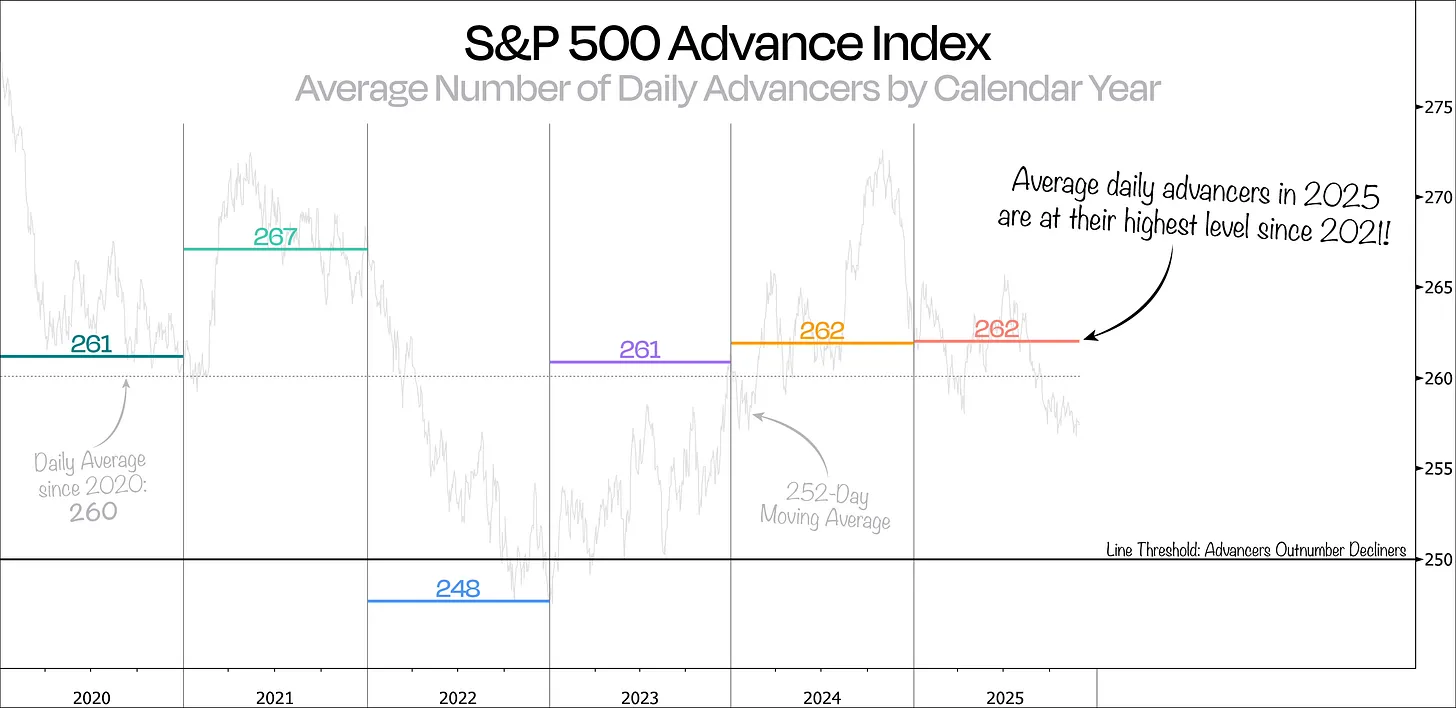
A better way to track long-term market participation is by observing the daily average number of advancing stocks over the full year, or using a rolling 252-day average.
From this perspective, 2025 has been quite strong—the average number of daily advancers reaching its highest level since 2021. In other words, market participation during this year’s bull market has been stronger than in recent years.
Notably, the rolling 1-year average (252 days) still remains significantly below this year’s average. The reason is simple: the 252-day average still includes data from last December, when the daily average of advancing stocks was only 204—extremely weak.
When we zoom out further, the picture becomes even more interesting.
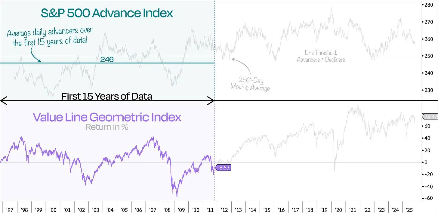
The next chart shows the complete data of the S&P 500 Advance Index, broken down into 5-year average cycles. Contrary to popular belief, the rolling 252-day average actually reveals that market participation has generally increased—not decreased—even as mega-caps have risen.
Besides 2025 standing out with near 30-year highs in average daily advancers, we can also see how narrow participation was just before the dot-com bubble peak. In fact, one of the worst 1-year periods occurred around March 2000, right before and after the bubble burst—when market participation was extremely low.
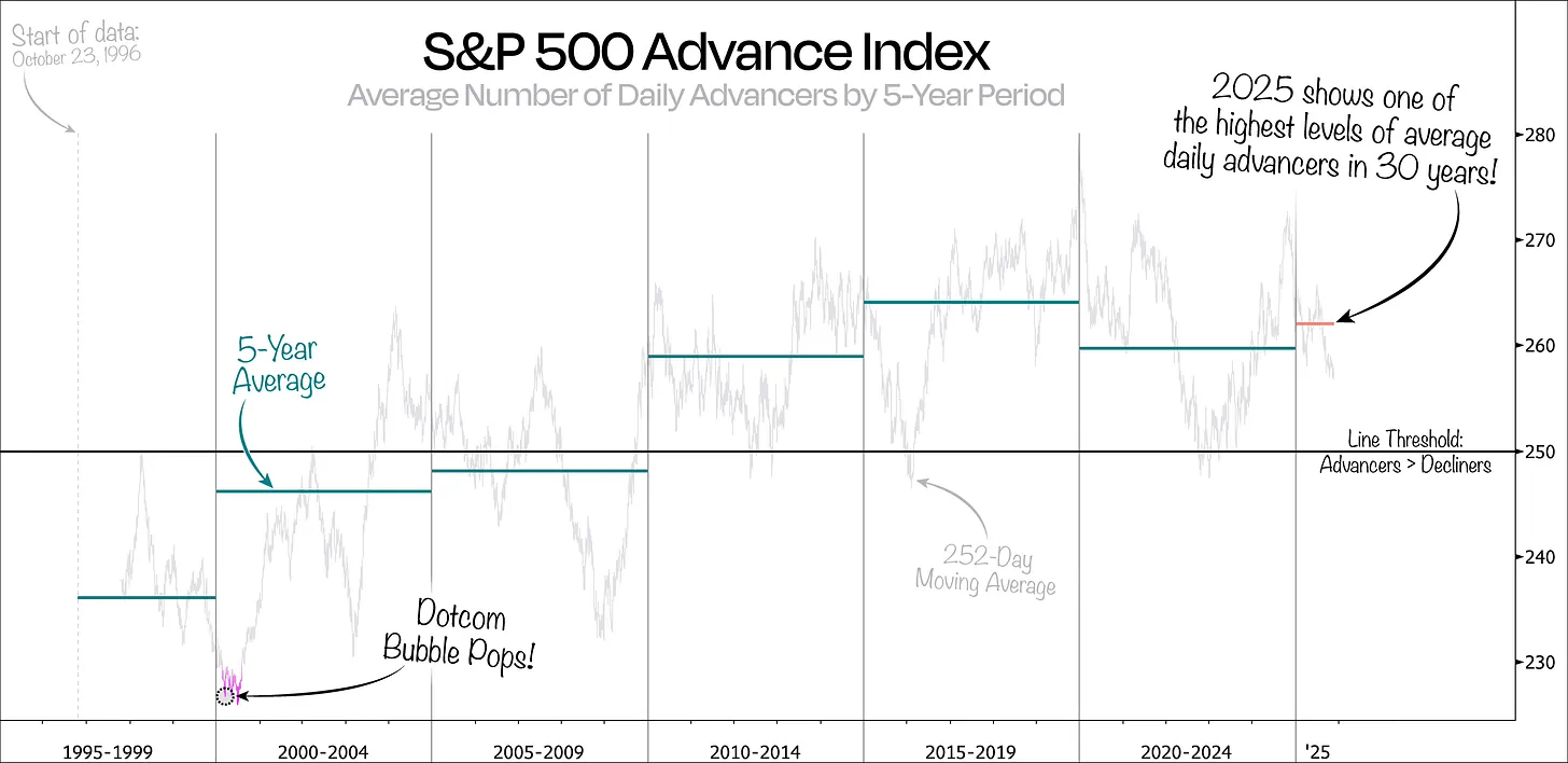
Despite covering nearly 30 years, one striking observation is that for most of the first 15 years, market breadth consistently stayed below the 250 threshold—the tipping point where advancing stocks outnumber declining ones.
In fact, when we plot the average number of advancing stocks during those first 15 years, the S&P 500 averaged only about 246 advancing stocks per day—meaning, on average, more stocks declined than advanced each day.
This aligns with the performance of the Value Line Geometric Index, which tracks the average return of typical stocks. Over that same period, the average stock in this index fell by approximately 8.5%, while the S&P 500 as a whole rose 75%.
So what does this mean for us today?
It suggests that today’s market is fundamentally different from the past.
Yes, occasionally a small group of mega-cap stocks will dominate headlines—inevitable given their size. But what makes today unique is that a larger number of stocks are now participating in the market’s advance.
That said, broader participation doesn’t imply uniform contribution. Large companies will still dominate index returns, but greater participation across stocks indicates a healthier market.
Conclusion: Broad market participation = healthy market; concentrated returns = function of index mechanics.
Join TechFlow official community to stay tuned
Telegram:https://t.me/TechFlowDaily
X (Twitter):https://x.com/TechFlowPost
X (Twitter) EN:https://x.com/BlockFlow_News